Friday, March 16, 2018

Millenial Pink / NPR

NPR is my default listening especially while driving so I was intrigued when the question on Ask Me Another was "when will Millennial Pink" go away.   The answer was no time soon. It seems it has taken fashion by storm and looks good on most people. When I got home I googled it and thought it looked a lot like "Ballet Slipper Pink" which Pantone had pushed for spring of 2017. Well which ever, it is a color that I have been using in lots of my more recent scarves and I am loving it.


It plays well with others and allows me to continue to explore my passion for building layers and textures.  These are posted in sequential order. This bottom one is still on the table batching. This is a cropped image of the center. It is a 60" square. I just love how versatile this color is in combination with a full range of other colors. Here's to #Millennial Pink .


Sunday, July 2, 2017

Complements to the Rescure


 As I left it 7/1

When I left yesterday I was hoping that I would hate the blue and red border less when I returned today to wash it out. Alas over night batching did nothing to make me like this better. So I had to resort to my risky but handy technique of calling in COMPLEMENTS TO THE RESCUE!

I decided to roll a blue green along the boarder and while I was at it I added diagonals to visually connect from one side to the other. All a little scary as I had liked what was there.


 deciding to just save a small strip of the blue and red. The new dyes are sill very wet. 

It is helpful that I have worked enough with the dyes to realize how much lighter they will dry. But that still remains a bit of a guess.

dyes much closer to dry here. Also it will be good to see it without the soda ash. 

leaving it to batch
I am much happier now, and think I can leave this alone to batch in peace. I will post after it is washed out. The white that you see in the dark blue violet loops is soda ash. I always wonder how much my light blue drop cloth influences my color choices? A question for another day.


Saturday, July 1, 2017

Connecting the Dots


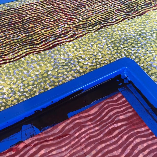
l have been working a lot with the idea of layers and am really enjoying making simple screens using screen filler and sometimes screen filler and drawing fluid. The screen you see on the bottom of the image is straight screen filler and it allowed me to print the red through the negative space.
hand painted with screen filler
printed in repeat

adding hand painted border with the same red


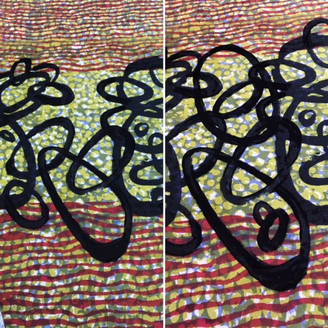
New screen done with drawing fluid and then screen filler. I printed it with a deep blue violet and left the space at the end of each screen empty. 

I have printed this screen the length of the fabric and left the space between the image and the frame blank, as the image does not make an aligned repeat. Instead I am just filling in the missing pieces by hand and creating my own "faux repeat". The image on the left shows the blank space the large central loop on the bottom was hand painted.  You can see on the left that I have just added more shapes. This solves the problem or repeat for me and allows me to just make it up as I go along. If you look to the image on the right you'll notice that I have added additional loops in the empty space.
It is a one of a kind piece so why not improvise as you go along?


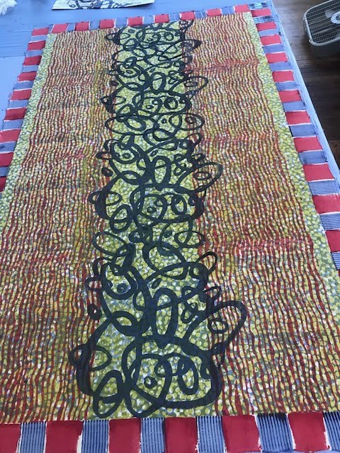
batching before washing out. 
 I am heading to Ireland for a workshop in a week and the center looping screen makes me think of Celtic Art meets up with The Jetsons. You get the sense of a repeat without it actually being one. Can't wait to see how this raw silk washes out.  It is 45"x 72" I love working in layers.

Friday, February 26, 2016

Viscosity Dyeing


My husband is a printmaker and has taught me a smidgen about viscosity printing. It involves using different viscosities of oil based ink in a monoprint or itaglio process in which the thickest inks act almost as a resist to the thinner inks. This may be completely wrong, but it is my blog and my memory so I am going with it.

The ochre shapes were screened first this is a close up of the center of the image below
I have experienced a similar and very surprising aspect of this while working with MX dyes on silk. So for now at least I am thinking of this as "Viscosity Dyeing" I am working on a series of pieces that remind me of tapestries or persian carpets. This is close up from the center of the piece.


54" square of tight twisted seersucker silk

The ochre reminded me of the lush tightly knotted carpets and I was fascinated that it overpowered the blues and just shines right through. I am guessing that this is because the strongly mixed ochre has filled up all the dye sites.  I liked the rug and border aspect so I have continued to explore this. 


Monday, November 23, 2015

Michael Olszewski

my work with Michael at Haystack
I had the great good fortune to spend 2 weeks studying shibori with Michael at Haystack in Summer of 2014.


Now I am excited to see his work that is part of a textile masters show until Nov. 24th at the Snyderman -Works gallery.  It is a beautiful show.


Michael's craftsmanship is flawless but never the point of the works. All the works are evocative and satisfying. His paintings/drawings/collages are made using the visual qualities of the fabrics. Marks are created by stitching, crocheting, knitting. The works are so elegant, but again that is not the point.
Michael OlszewskiThe Disturbance, Wool felt, silk, linen, metal, hand stitching, appliqué and paint, 29.625" x 29.125" (framed), 2014

Michael OlszewskiAugust, Silk, wool, hand-stitched and appliquéd, 23.5" x 20.25" (framed), 2015


Michael OlszewskiAn Attempt, Silk, linen, hand stitching and appliqué, 23.25" x 20.25" (framed), 2013


Michael Olszewski, Lisbrin, Silk, wool, metal, hand-stitched and appliquéd, 29.625" x 29.125" (framed), 2015


Michael Olszewski, A Reminder, Silk, wool, leather, cotton, hand-stitched and appliquéd, 23.5" x 20.25" (framed), 2015

Michael OlszewskiThe Return, 12"x 10", Fiber construction in crochet, applique and stitching, cotton, silk, linen, leather and metal, 2008


Thursday, September 10, 2015

Second dye bath on cotton gauze

 I realized I have no images of all the pieces soaking in their second dye bath. I repositioned all the clamped resists and soaked all the pieces in a deep violet mixture of mx. I will take you through the opening of the gauze piece. Please forgive the blurry images. I was excited. This gauze took up much more blue... so it has only violet where it bled under the clamps. Perhaps it was because the silk grabbed the boysenberry in the dye mix before this cotton gauze got a chance.

clamped gauze


a few clamps removed revealing the blue green beneath the clamps


Wet and open in one direction
Fully open
So much to learn... each element creates it own pattern all of it controlled by the fold. And of course each fabric a different feel and look.

Opening the packages Hemp fold

Many of these shots are blurry. They were meant to help me remember what I did. But there is still  much to be learned from them. I tried to take a shot of each step. This first piece goes from shifting the clamps and resist piece in preparation for the second dye bath... thru to finish.
rinsed but still clamped from first dye bath

Surprise... that dark piece of plastic must have had dye on it Oops.  Reclamping for second dye bath

Opening after dyeing in deep mixed MX violet. 

Fully open

I love how the purples separate and seep into the whites.  The silk once again grabbed more of the warmer colors. It took up more yellow in the first dye bath and more boysenberry in this one. I am guessing that those colors were smaller or faster moving and the blues took their time. Look at the post on the cotton gauze to see how very different the purples are.